Jemma Saunders Colour Consultant at Crown Paints, discusses the importance of colour and purpose when creating a thoughtful interior design.
People’s responses to the design of homes and other spaces can often be unconscious. For example, while many will have clear opinions about our taste (a preference for bright colours or minimalist spaces), other reactions can be more difficult to define. Often, it’s these subtleties that can have huge impacts on mental health.
Added to this – between work, school and home – research shows that up to 90% of peoples time is spent indoors. And, after two years spent almost entirely in our homes, never has it been so crucial to consider the impact that our spaces and their design have on our emotional wellbeing.
Positivity in design
Balance is the key to any successful design. Tactile fabrics, decorative lighting, appealing smells, attractive colour schemes and natural elements like plants, all interact to play an important role in creating a positive multisensory experience.
In contrast, harsh sounds, unpleasant odours, hard lighting and distracting patterns can overwhelm the senses and cause stress. A lack of stimulation can be just as bad.
Taking a holistic approach to design, which includes a comprehensive review of everything from furnishings, layout, lighting, colour, air quality, smells, sounds and temperature, is key to creating an environment that fosters a positive environment for wellbeing and mental health.
The importance of colour
While there are a number of elements that impact the overall effect an interior design can have, there is none more so evident than colour. Whether an interior is destined for relaxation, social interaction or work, colour makes a significant impact on the emotions people feel when they walk into a space.
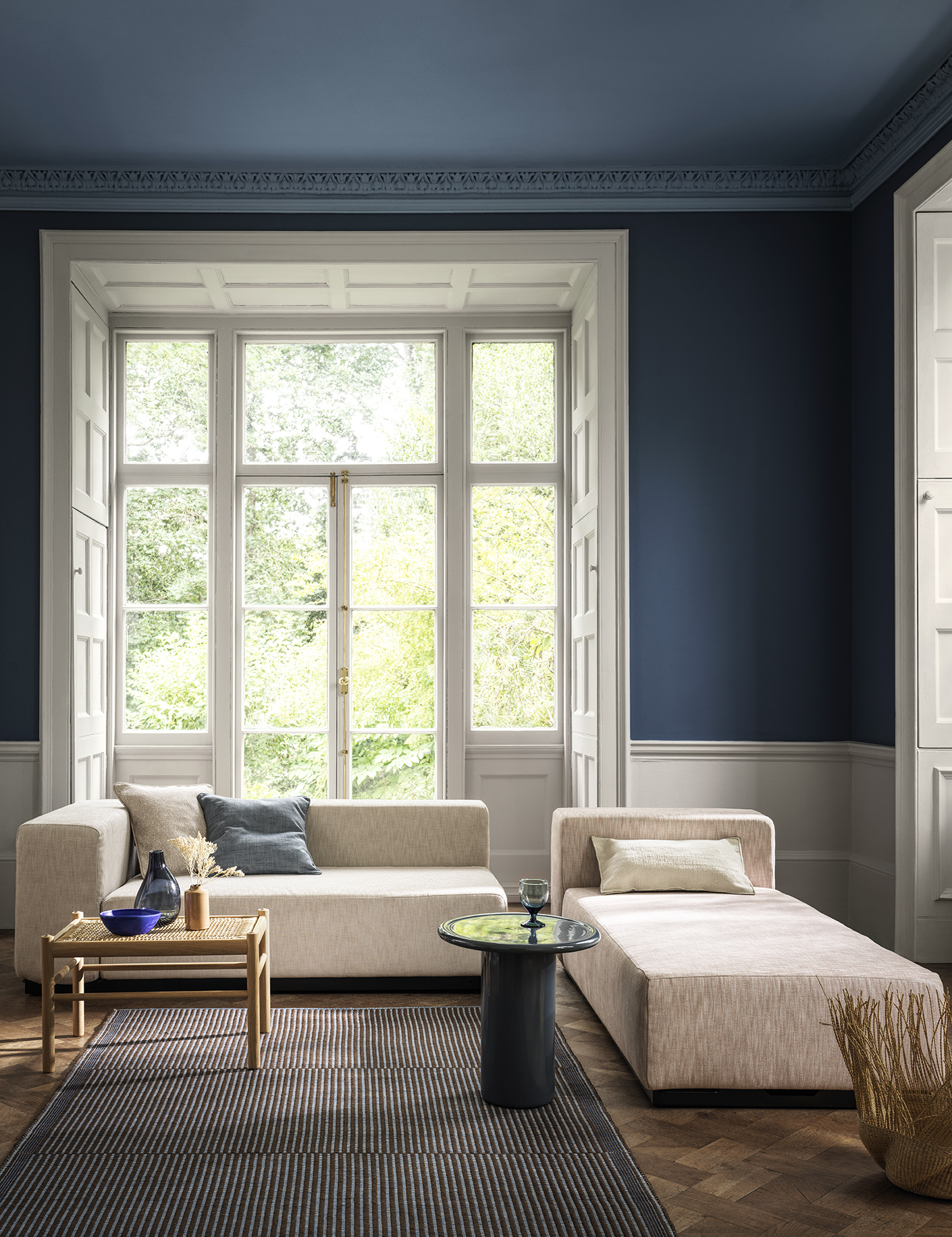
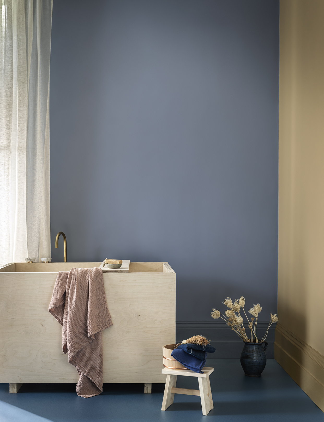
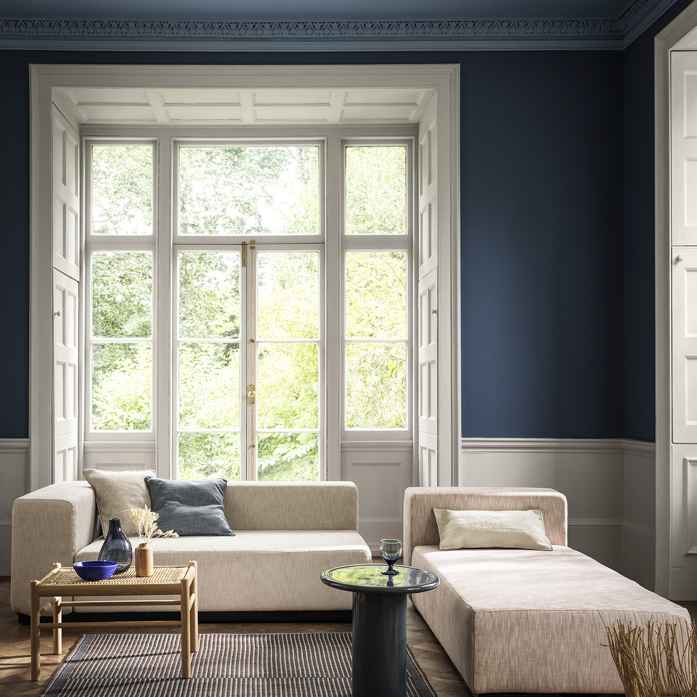
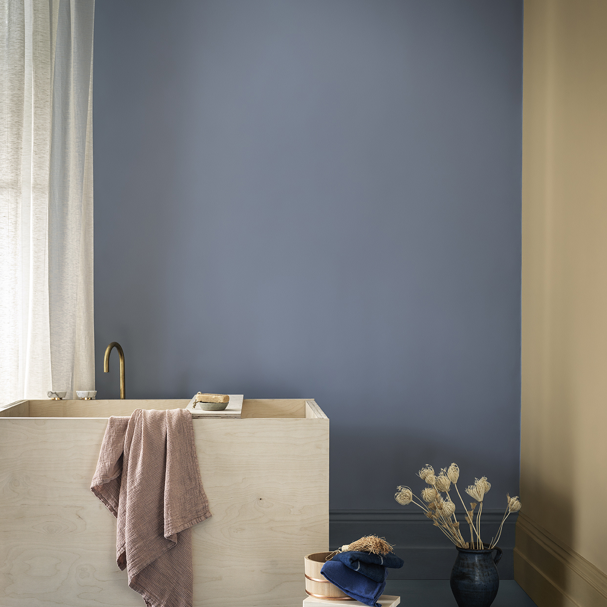
Cool colours, like pale blues and greens, are great hues to create a restful and harmonious environment. They evoke a calmness and clarity that people often crave from their living spaces.
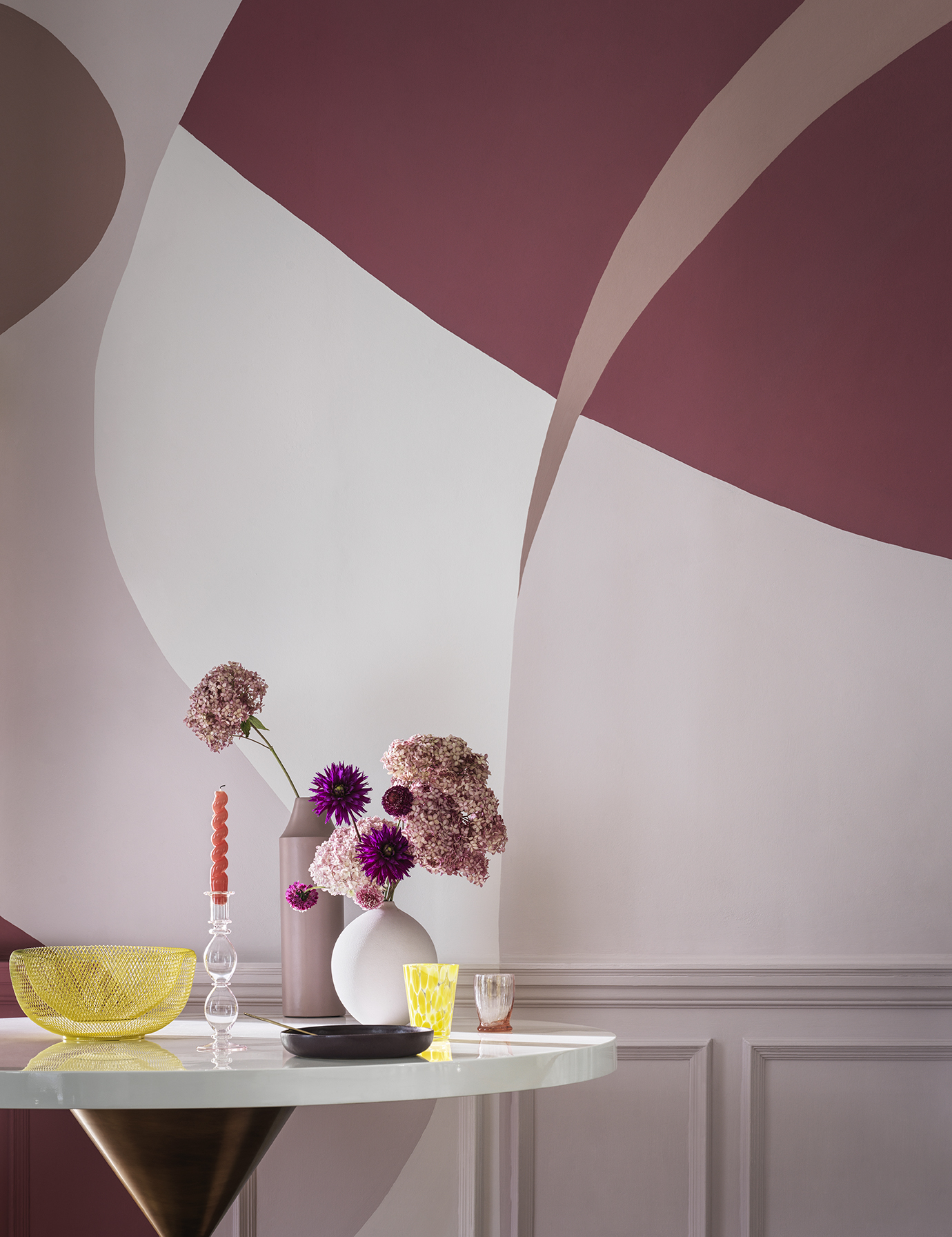
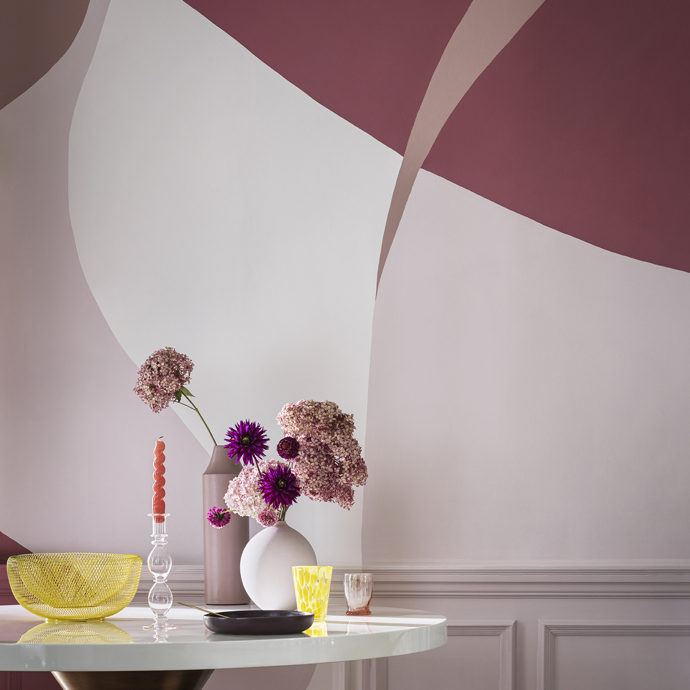
Alternatively, intense warm shades like red, orange and yellow can evoke a more emotional response and are popular in lively, communal areas like kitchens and living rooms.
In a work environment, darker shades can make an area feel more enclosed and private, which can serve a great purpose in a meeting room setting. Darker colours that are closer to grey and less vibrant can be restful and grounding. Whereas lighter colours can open a space and lend themselves perfectly to communal work areas.
And, of course, colour can be used to reflect and enhance natural surroundings or highlight particular design features. Picking the right hues can help ensure your interior designs resonate with the people using the space.
Trend watch
For many, picking the right colour can be an onerous task. So, often it’s useful to look to upcoming trends to see what styles or influences are likely to play a big role in interior design over the coming months and years.
Every year the Crown’s trends panel members come together to review any design developments and societal attitudes and behaviors to begin the creative process of creating a series of inspirational colour palettes and stylised photography.
Each palette is based upon a theme and whilst always forward thinking – they can take influence from various aspects including product design, architecture, pattern and print as well as a reflective look at pivotal art movements.
One of Crown’s key trends for Spring Summer trends 2022 is ‘Reset’, which is all about evoking a feeling. In this case, the Mediterranean-inspired themes and colour palettes provide a sense of calm to people’s walls, offering the chance to unwind and relax when entering the safety of a home.
Help is at hand
The team at Crown Paints have a passion for colour and its impact, which is why they’ve created a wide range of resources to help the architecture, designer and specifier community when it comes to interior design.
Crown Paints have a range of curated colour palettes for different spaces including homes, workplaces and university accommodation. These show how different shades can be used to reflect specific space requirements.
Meanwhile, inspiration from Crown’s Interior Colour Book – a part-educational, part-visual resource – includes topics like colour psychology and how its use has evolved over time, alongside guides to help you do more with different tones and shades.
For more information, advice and inspiration, please visit the colour section on the Crown Paints Professional website, which can be found here: https://www.crownpaintsprofessional.com/colour/
Blog: The Importance of Colour and Purpose in Interior Design
| T | (0330) 0240 310 |
|---|---|
| E | info@crownpaintspec.co.uk |
| W | Visit Crown Paints's website |
| Crown House, PO Box 37, Hollins Road, Darwen, Lancashire, BB3 0BG |


