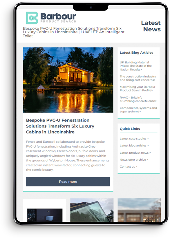
Colour is a trick of the light; a love letter gifted to us by a universe that is made up of wondrous things.
In more modern practices, colours have been proven to soothe and reinvigorate. University researches in Lille found that greenery and colours both showed a boost in morale. Interior designers espouse frequently on the use of natural timbers to add warmth into the homes, on designating colours such as blue for restful areas and red for living rooms and kitchens, yellow flowers for the garden to brighten up dull days, creamy white shades for bathrooms and places with less sunshine to lift the gloom.
Furnitubes products have always been available to you in one of over 200 RAL shades, and that option is still there.
From now, all of Furnitubes’ core furnitures will be ready available in a reduced colour palette, standardised across all our product lines, with no additional lead time required. This gives you greater opportunity to branch out of the standard grey and brighten up builds both new and old with a little touch of what people turn to poetry.
Read more on the colours chosen and the selection process here.
At the end of that exercise, Furnitubes had over 60 colours to choose from, collected from the best of each separate ideal.
The intention with the furniture is to blend into heritage settings, and liven up the grey.
However, they also want to give the creative designers, contractors, and buyers the opportunity to reverse that, if they want to – without burdening them with an overwhelming choice of colours.
For the latest industry news and newest podcast releases, sign up to the Furnitubes monthly newsletter.
The importance of colour in placemaking